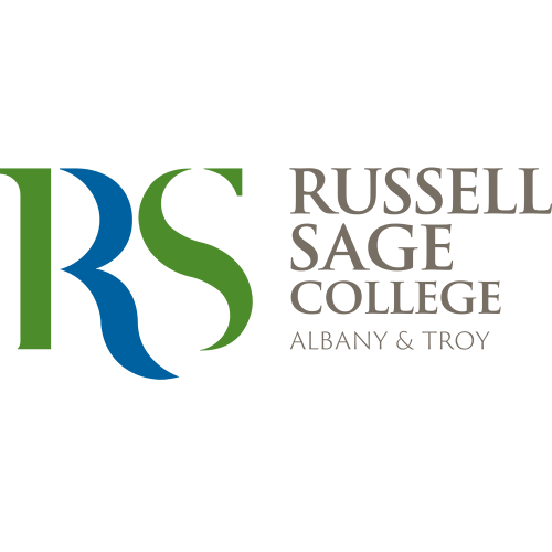
With a new name and market position, Russell Sage College needed an identity embodying its legacy and unifying its two campuses. The solution was a clean, modern, and fluid letter mark that used two colors to equally represent each location and highlight the Hudson River that runs between them.
The Russell Sage College rebrand wasn’t only about its visual identity; positioning and messaging also needed to be addressed. The school needed room for growth in addition to managing its numerous audiences. Adding in the fact that they were eliminating the women’s college but naming the entire institution after what had been the women’s college name, other groups needed to be informed as to why this change had been made and how it would affect them.
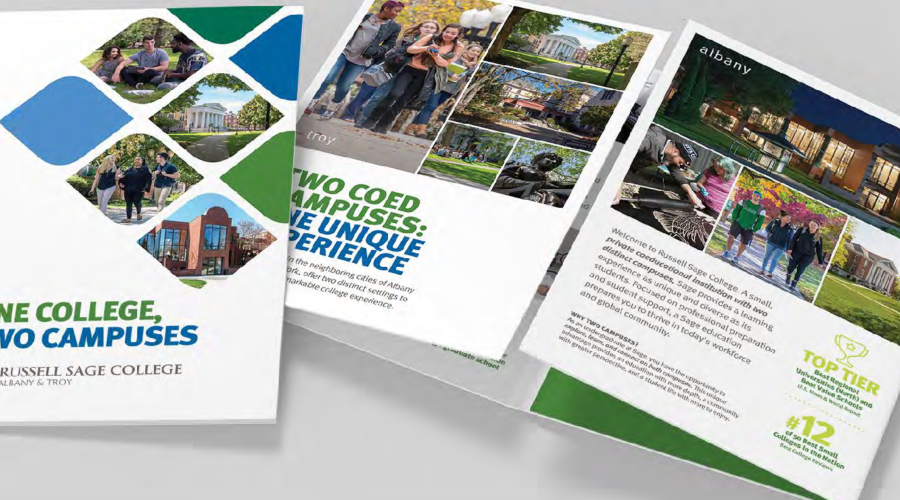
Additionally, Paul’s team at tyny co. developed messaging to reflect the College’s new strategic direction. Prospective students were introduced to these new elements through streamlined undergraduate and graduate viewbooks.
The successful rebrand sparked the drive to become a fully coed institution, delivering increased enrollment, reducing the debt burden, and lifting the College’s credit rating.


